Readers have probably heard that social mobility is low in the UK by international standards. A number of sensationalist stories have led with headlines such as “Britain has worst social mobility in western world“ and that “UK has worse social mobility record than other developed countries“.
Leading policymakers have made similar statements. To quote England’s Secretary of State for Education Michael Gove: “Those who are born poor are more likely to stay poor and those who inherit privilege are more likely to pass on privilege in England than in any comparable country”.
But is this really the case? Are we sure social mobility is indeed lower in this country than our international competitors? Or is it the case that, just like global league tables of educational achievement, there remains great uncertainty (and misunderstanding) surrounding cross-national comparisons of social mobility?
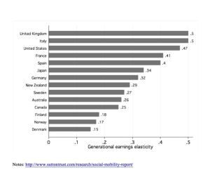
The answer can actually be found by exploring a little further academic research that has been published on the Sutton Trust website. Figure 1 is taken from a Social Mobility Report published on 21 September 2012.
Saving the technical details for another time, the longer the bars in this graph, the less socially mobile a country is. Here we see a familiar story; Britain ties with Italy as being the least socially mobile.
Figure 2, however, tells a different story. This is taken from another report published by the Sutton Trust just three days later.
This graph plots a measure of income inequality (horizontal axis) against an economic measure of social mobility (vertical axis). Thus the closer a country is to the top of the graph, the lower its level of social mobility. Now, it appears that the UK may actually be more socially mobile than France, Italy and the US, and very similar to countries like Australia, Canada and Germany. Perhaps even more surprisingly, the UK is also similar to Sweden, Finland and Norway. Indeed, the only country that we can have any real confidence that the UK is significantly different to is Denmark.
Why is there such a contrast between these two sets of results? The trouble is, cross-national studies of social mobility have to rely upon data that are not really cross-nationally comparable. Rather, data of varying quality have been used in each of the different countries. Individuals are interviewed at different ages, using different questionnaires and survey procedures. Indeed, even different statistical analysis methods are used. No wonder, then, that social mobility in the UK can look very different, depending upon which dataset and method of analysis are used.
So although global rankings of educational attainment can be misleading, so can those of social mobility. In fact, problems with international comparisons of social mobility are often significantly worse. Yet this does not seem to stop journalists and policymakers making bold claims that “Britain has some of the lowest social mobility in the developed world“. Things are rarely so black or white in the social sciences – and social mobility is no exception. This uncertainty should be recognised when journalists and government officials report on social mobility rankings in the future. Otherwise, I fear for the credibility of this extremely important social issue.


Pingback: People having a pop at PISA should give it a break… | IOE London blog
Pingback: People having a pop at PISA should give it a break… | John Jerrim